Previous Employer Branding
- Next
Cross channel Campaign
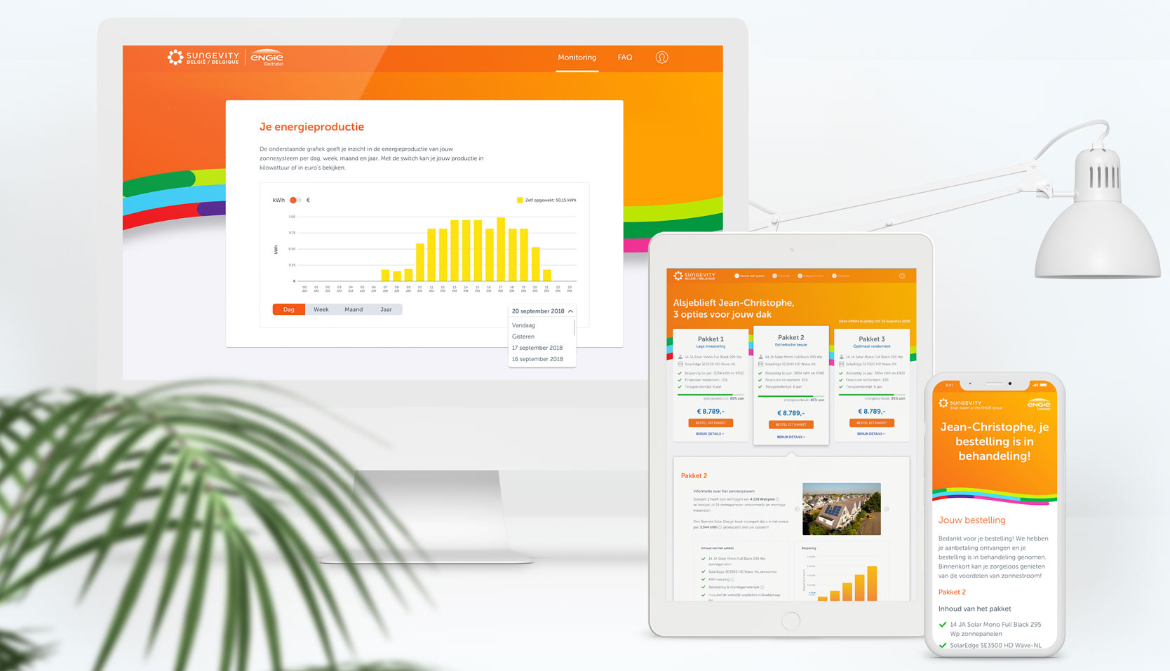
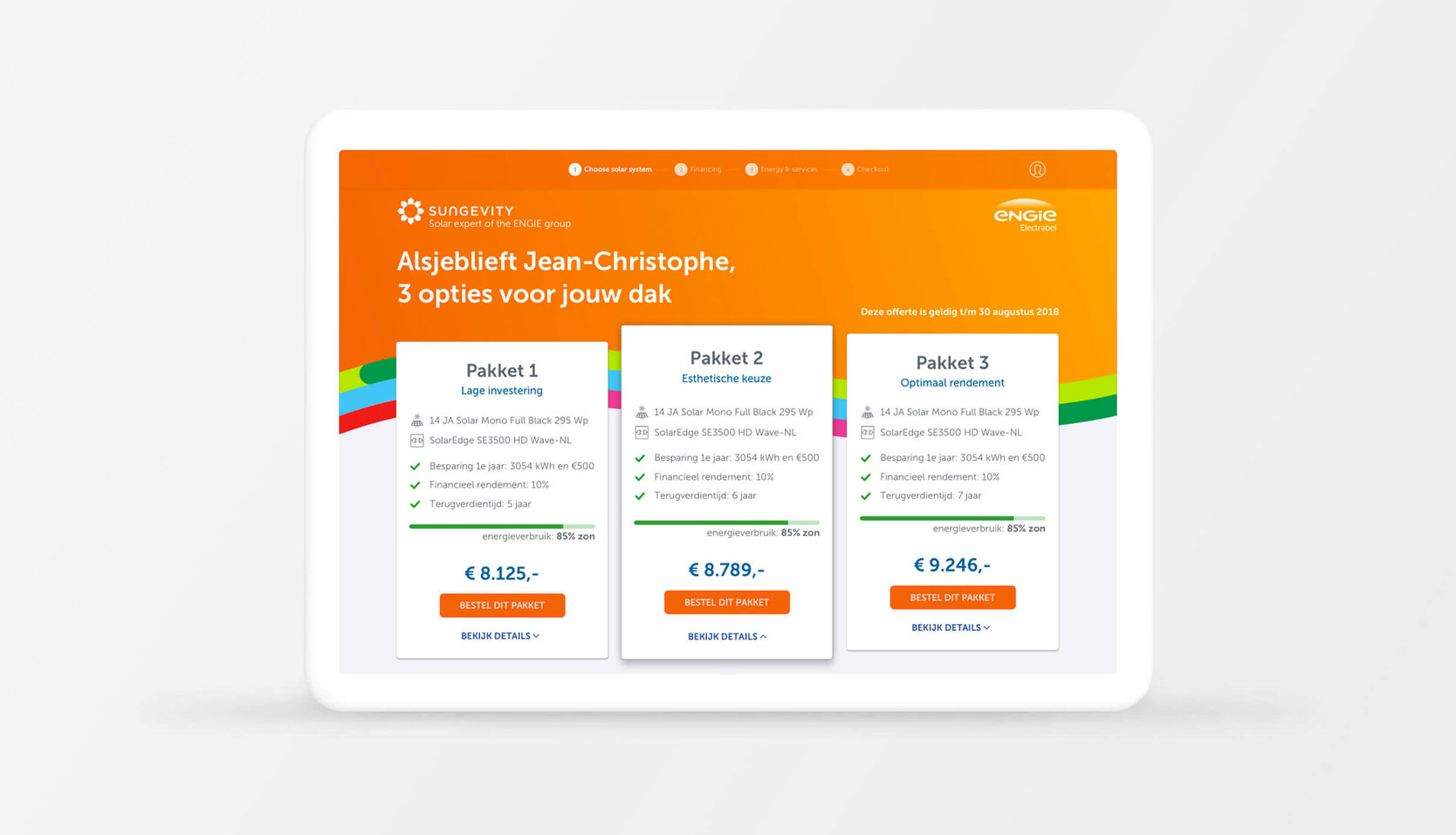
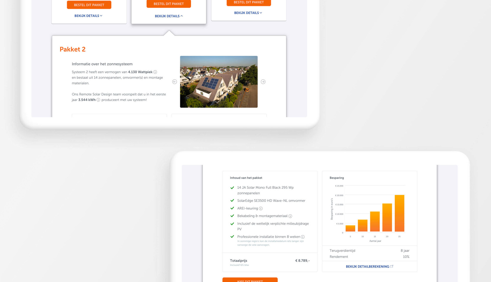
The quotation tool redesign started with a discovery phase to learn more about the business goals & user needs of Sungevity and Engie. Several workshops with team members from different departments (management, marketing, CC, sales) informed the design criteria and the opportunities for improvement within the customer journey.
The design phase was a collaborative process in which low-fidelity wireframes were gradually transformed into a full fledged interactive prototype. User testing and feedback rounds with the team were conducted throughout the process.
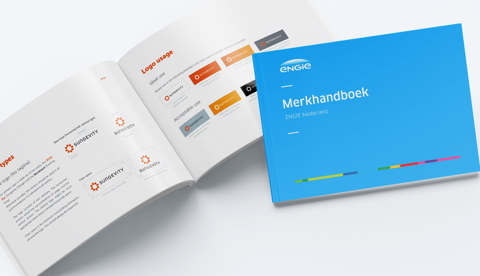
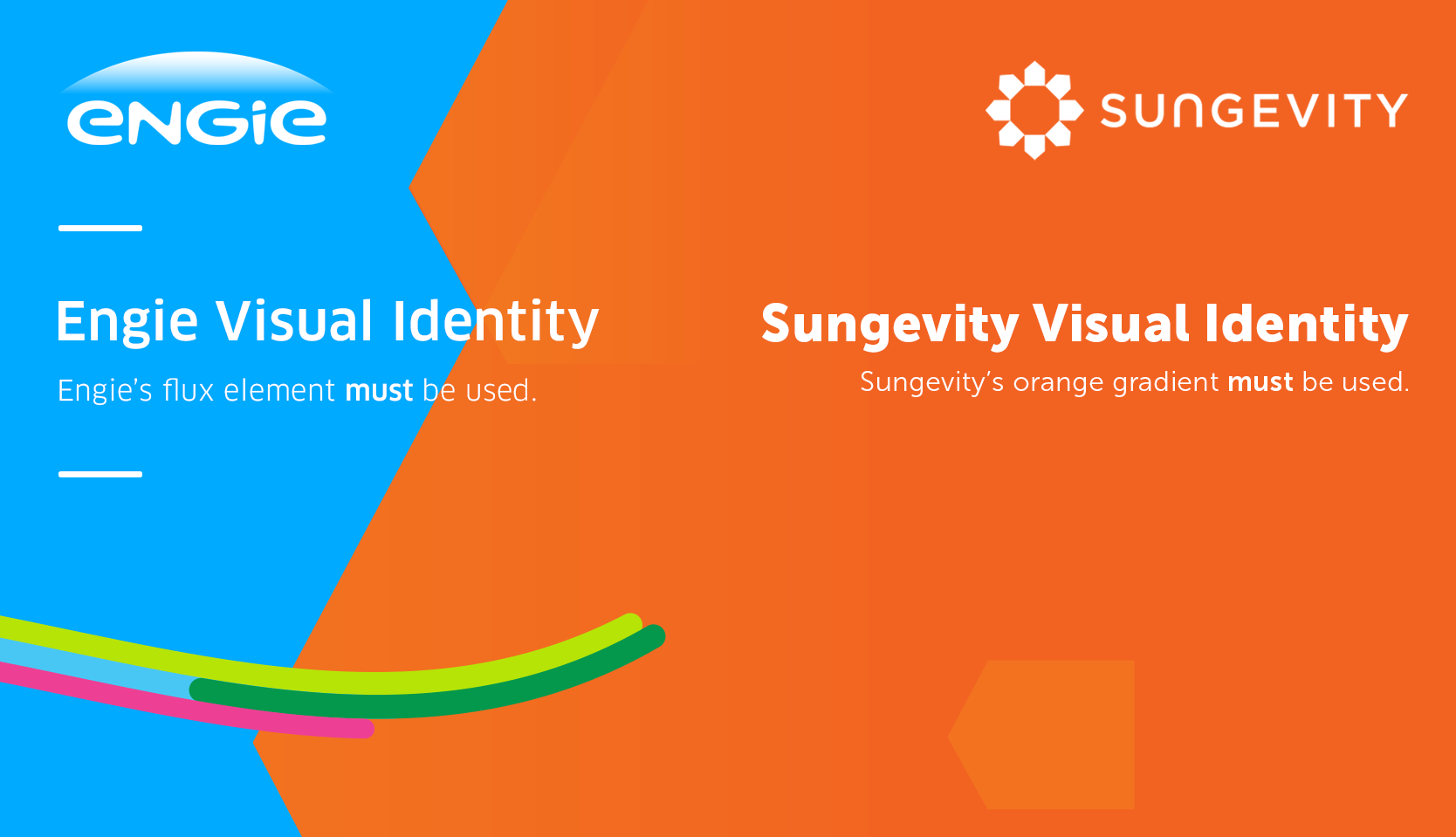
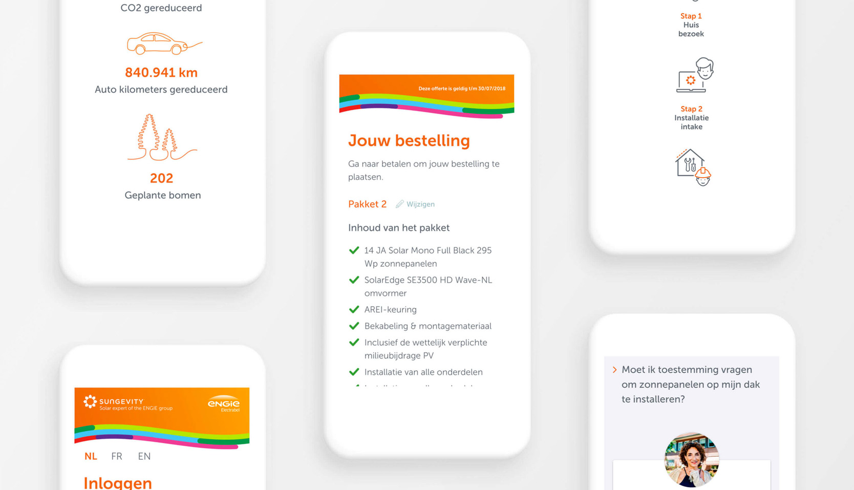
Several workshops concluded the definition of co-branding. Sungevity should be leading, by a 80/20 ratio, in visual communication by color, style elements and typography.
Some guidelines of co-branding usage where set-up; Engie's visual Flux element must allways be visible and Sungevity's Orange gradient must be shown in every screen.
